The Science Behind Barcode Scanning
Barcode scanning is a fundamental technology used in various industries for inventory management, retail sales, and logistics. At the core of this technology lies a sophisticated mechanism that interprets information encoded within the varying widths of bars and spaces. To understand how scanners work, it is essential to explore the principles of light reflection and detection.
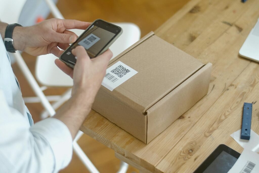
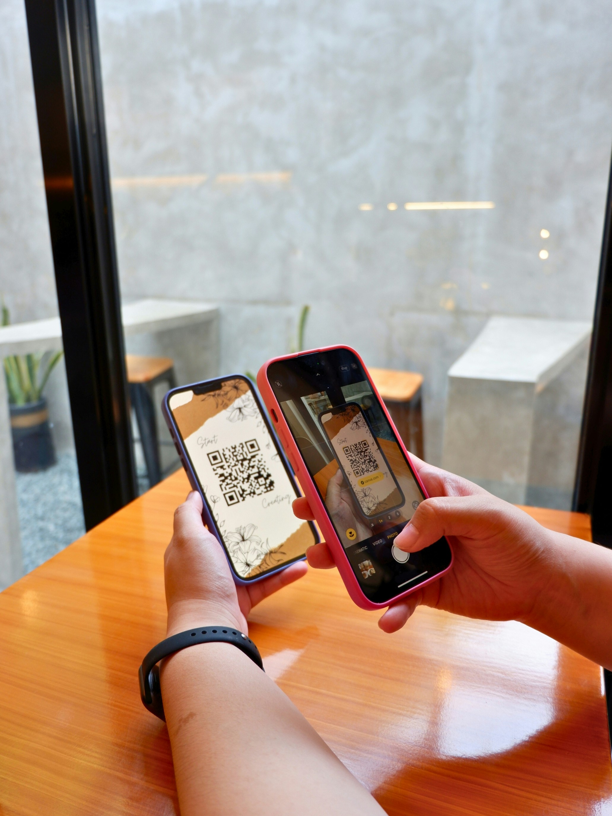
Barcodes consist of alternating black and white bars, where the widths of these bars represent specific numerical or alphanumeric data. When a barcode scanner is employed, it emits a beam of light—typically from a laser or an LED—toward the barcode. The scanner’s sensor receives the reflected light, which varies based on the color and width of the bars. Dark colors, such as black, absorb more light, whereas light colors, like white, reflect it. This contrast is critical; scanners rely on the varying levels of light received to interpret the data accurately.
The detection mechanism within the scanner processes the reflected light to generate an electrical signal that corresponds to the bar widths and spaces. This conversion from light to a digital format enables the scanner to decode the information stored within the barcode. Factors such as ambient light conditions, surface texture, and, importantly, color contrast directly impact the efficiency and accuracy of this process. High-contrast barcodes—with a stark difference between the bar colors—tend to yield better scanning results than low-contrast ones, which may lead to misreads or failures in detection.
Thus, understanding the science behind barcode scanning is paramount for optimizing the design of barcodes. By considering factors like color contrast and ensuring that the barcode adheres to the principles of effective perception, businesses can significantly enhance scanning reliability in their operational processes.
Understanding Color Contrast
Color contrast refers to the difference in luminance or color that makes an object distinguishable from its background. In the context of visual perception, higher contrast improves visibility, leading to better readability and efficiency in various applications, including barcode scanning. Optimal color contrast ensures that the elements within a visual design, such as barcodes, are easily identifiable, thereby facilitating quick interpretation by scanners and improving user experiences.
When it comes to barcode implementation, the choice of colors significantly influences scanning effectiveness. High contrast combinations, such as black bars on a white background, create a clear distinction that scanners can easily detect. For instance, this classic black-and-white barcode format is universally accepted and recognized, ensuring consistent performance across various scanning devices. In contrast, using low-contrast colors, such as dark blue bars on a black background, can hinder the scanning accuracy. Such combinations may cause scanners to misinterpret the barcode or fail to read it altogether, ultimately leading to inefficiencies in inventory management, sales transactions, and more.
Furthermore, color contrast is not only important for the scanners but also essential for human operators who may need to inspect barcodes manually. High-contrast barcodes allow for quicker and more accurate visual verification, which can be crucial in retail and logistics environments where time is of the essence. Conversely, low-contrast scenarios can lead to human errors during manual checks or prolonged scanning times due to inadequate visibility. Therefore, understanding and applying effective color contrast in barcode design is critical for ensuring optimal scanning performance and a seamless user experience.
How Color Choices Affect Scanning Performance
Color choices play a crucial role in the effectiveness of barcode scanning, significantly impacting scanning performance. The primary function of barcodes is to encode information in a format that can be easily scanned and interpreted by optical readers. Therefore, the contrast between the barcode and its background is vital for ensuring successful detection. Generally, black bars on a white background are considered the most effective combination, as this high-contrast pairing maximizes visibility.
Other color combinations can also be effective, but they must be chosen carefully to avoid diminishing the scanning capability. For instance, dark blue or dark green can work similarly well against a white background, as these shades provide adequate contrast. However, when less contrasting colors are used, such as light yellow or light grey bars on a white background, the visibility decreases significantly, leading to scanning difficulties. This results from the reduced light reflectivity and sometimes causes scanners to misread or fail to read the barcode entirely.
It is worth noting that the choice of colors not only affects visibility in well-lit conditions but also under various lighting scenarios. In low-light environments, high contrast remains essential; therefore, using vivid colors may help improve scanning accuracy. On the other hand, excessive brightness or overly intricate designs can also hinder performance, as scanners might struggle to differentiate between the barcode and its background.
Additionally, the material on which the barcode is printed contributes to the overall effectiveness. Matte finishes can absorb light and reduce glare, which is often beneficial for enhancing readability. Conversely, glossy surfaces may reflect light, potentially affecting how well scanners read the code. Hence, careful consideration of color choices and printing methods is crucial for optimizing barcode scanning performance and ensuring that operational efficiency is maintained.
Case Studies: Effective and Ineffective Barcodes
Analyzing real-world examples of barcode implementations reveals crucial insights into the significance of color contrast in successful scanning operations. One notable case is the retail chain Target, which adopted color-coded barcodes for its inventory system. The vibrant, high-contrast barcodes against neutral backgrounds facilitated rapid scanning, significantly improving the efficiency of checkouts and inventory management. This implementation not only enhanced user experience but also reduced operational errors, effectively showcasing the importance of optimal color contrast.
Conversely, a contrasting case study is found in a regional grocery store that used low-contrast barcodes on products with bright, patterned packaging. The barcodes were inadequately designed in shades of blue and green, which rendered them difficult to read under various lighting conditions. As a result, customers faced issues at checkout, causing delays and frustration. Implementing high-contrast designs may have mitigated these challenges, emphasizing the need for adequate color differentiation between the barcode and its background.
Another significant example can be derived from the pharmaceutical industry, where the color contrast in barcodes can directly impact patient safety. A well-known nationwide pharmacy implemented a robust barcode system featuring high-contrast colors for medication labels. This system enhanced the accuracy of dispensing prescriptions, ensuring that pharmacists could quickly and accurately verify medications. In contrast, a small pharmacy opted for pastel-colored barcodes, which often blended into the packaging. This misstep occasionally led to scanning inaccuracies, illustrating the critical role that color contrast plays in environments where precision is paramount.
These case studies underline the lessons learned from effective and ineffective barcode implementations, highlighting the necessity of optimizing color contrast to improve scanning accuracy and operational efficiency. The strategic use of color contrast not only enhances the usability of barcodes but also supports overall business performance in various sectors.
Testing for Color Contrast in Barcodes
Testing for color contrast in barcodes is crucial for ensuring their readability and functionality during scanning. Color contrast directly affects the ability of barcode scanners to accurately interpret the encoded information, and poor contrast can lead to scanning failures. There are several methods and tools available for evaluating barcode contrast that can be categorized into visual assessments and software-based evaluations.
One practical approach is to conduct visual tests where individuals with varying degrees of color vision examine the barcode. This approach can highlight potential issues that may not be captured by standardized measurements or software tools. It is important to select diverse participants to ensure a comprehensive understanding of how different users perceive the barcode colors. Having multiple perspectives can uncover color combinations that may be problematic for specific individuals, ultimately aiding in refining designs for wider accessibility.
Alongside visual assessments, there are software tools specifically designed to analyze color contrast in barcodes. These tools can measure the lightness and darkness of the barcode’s foreground and background colors, providing quantifiable data on the contrast ratio. Adopting such software can help identify potential problems and facilitate adjustments before finalizing the barcode design. Some tools can simulate how barcodes will appear under different lighting conditions, which can further enhance readability in various environments.
Moreover, following best practices is essential when designing barcodes. Selecting high-contrast color combinations, such as dark bars against a light background, is generally recommended. It is also beneficial to avoid colors that are perplexing for colorblind users, such as combinations of red and green. Implementing these methods and tools will not only enhance the functionality of barcodes but also improve overall user experience, ensuring that they scan efficiently across a range of devices and settings.
Tips for Designing Barcode Labels
Designing effective barcode labels is crucial for ensuring seamless scanning and minimizing errors. One of the most significant aspects to consider is color contrast. The color of the barcode itself and its background must be distinct enough to ensure easy recognition by scanners. For instance, dark bars against a light background tend to enhance readability, while light bars on a dark background can also be effective, provided that sufficient contrast is maintained. Avoiding colors that are too similar in tone is vital, as this may lead to scanning issues.
Additionally, the layout of the barcode should be simple and uncluttered. Text, logos, or graphics should not overshadow the barcode or interfere with its readability. It is essential to provide adequate white space around the barcode, which allows scanners to distinguish the barcode from surrounding elements. A minimum margin of 2mm is often recommended to help improve scanning efficiency.
Moreover, the choice of materials and finishes used for printing barcodes should not be underestimated. Glossy labels may create glare, affecting the scanner’s ability to read the barcode accurately. Opting for matte or non-reflective materials can enhance visibility, ensuring that scanners capture the needed data effectively. When it comes to size, ensuring that the barcode is large enough to be scanned from the intended distance is pivotal; however, keep in mind that excessive scaling can lead to distortion, resulting in further scanning problems.
Lastly, testing barcode labels in their intended environment prior to full-scale production can help identify potential issues. Conducting scans under various lighting conditions will provide insights into the effectiveness of the color contrast and overall design of the barcode. By following these guidelines, businesses can create barcode labels that are not only visually appealing but also functionally effective, ultimately maximizing scanning efficiency and reducing operational disruptions.
The Future of Barcode Technology and Color Contrast
As technology continues to evolve, so too does the landscape of barcode systems, particularly in the realm of color contrast. Recent advancements have led to the development of innovative scanning techniques and materials that not only enhance the visibility of barcodes but also improve their overall functionality. One key trend is the integration of machine learning algorithms in barcode scanners, which enables devices to analyze and adapt to various color contrasts effectively. This ensures that even non-traditional color combinations can be scanned reliably, expanding the usability of barcodes in diverse settings.
Moreover, the emergence of dynamic barcodes that can alter their color populations based on ambient lighting conditions presents an intriguing development. These smart barcodes adjust their contrast in real-time, maximizing readability under varying environmental factors. Such advancements signify a move towards more adaptable and robust scanning systems that take into account the nuances of visual perception. Consequently, this could lead to a wider acceptance of color variations in barcode design, allowing for a more visually appealing presentation without sacrificing functionality.
In addition to machine learning and dynamic barcodes, advancements in ink technology and printing methods could play a significant role. The advent of high-contrast inks that can reflect specific wavelengths of light may enable barcodes to stand out even in cluttered visual environments. This could enhance the reliability of barcode scanning across multiple industries, from retail to transportation. Furthermore, the research and development of smart devices equipped with integrated scanners designed to work optimally with various color contrasts can potentially revolutionize the way barcodes are utilized. These developments signify a promising future where color contrast is not just a consideration but a pivotal element of barcode efficiency and design.
Conclusion and Key Takeaways
In conclusion, the significance of color contrast in barcode scanning cannot be overstated. Throughout this discussion, we have explored how the interplay between barcode color and background color directly influences the effectiveness of scanning technology. High contrast between these elements is essential for optimal readability, particularly in environments where lighting conditions may vary.
One of the critical takeaways is the importance of selecting the right color combinations. Typically, dark colors, such as black or navy, paired with light backgrounds, such as white or yellow, tend to yield the best scanning results. Conversely, low contrast combinations can result in scanning failures and reduced operational efficiency, especially in retail and logistics sectors where time is sensitive.
Furthermore, practical applications of this knowledge extend beyond mere efficiency. They involve considerations of branding, as businesses often wish to align barcodes with their overall aesthetic while ensuring functionality remains intact. This dual focus on design and performance reinforces the necessity of careful color selection not only for barcodes but also across all aspects of product packaging.
As industries continue to adopt advanced scanning technologies, understanding the effects of color contrast will aid in minimizing errors, streamlining operations, and enhancing customer experience. Businesses should evaluate and, if necessary, adjust their barcode designs to maximize visibility and ensure that scanning devices can perform at their best. Overall, being aware of the implications of color contrast will contribute to more reliable and efficient barcode scanning systems in various applications.
© barcodly.com- All rights reserved